We started regular Drupal usability meetings twice a week almost a year ago in March 2016. That is a long time and we succeeded in supporting many key initiatives in this time, including reviews on new media handling and library functionality, feedback on workflow user experience, outside-in editing and place block functionality. We helped set scope for the changes required to inline form errors on its way to stability. Those are all supporting existing teams working on their respective features where user interfaces are involved.
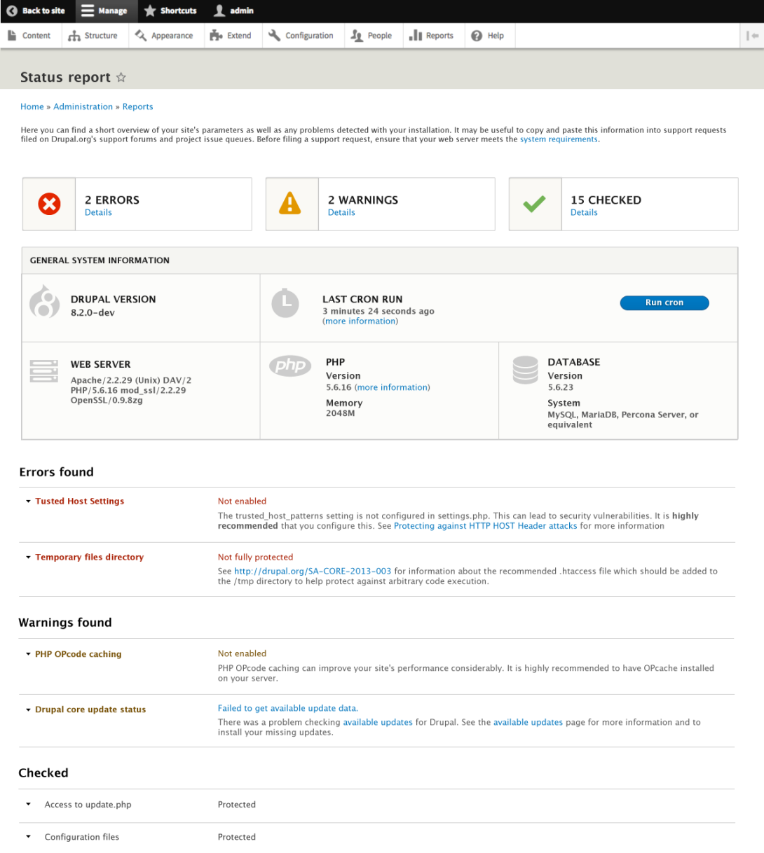
However, we also started to look at some Drupal components and whether we can gradually improve them. One of the biggest tasks we took on was redesigning the status page, where Drupal's system information is presented and errors and warnings are printed for site owners to resolve. While that looks like a huge monster issue, Roy Scholten in fact posted a breakdown of how the process itself went. If we were to start a fresh issue (which we should have), the process would be much easier to follow and would be more visible. The result is quite remarkable:

